
How Are Charts Formed?
There are different chart types. We will focus on the four most popular charting methods—line, bar, candlestick, and point & figure charts.
Line Chart
The closing level is more significant to certain traders and investors than the open, high, or low.You can disregard intraday fluctuations by concentrating solely on the closing. When open, high, and low data points are unavailable, line charts are also utilized.For some indexes, sparsely traded equities, and intraday prices, only closing data is occasionally available.
An example of a line chart.
Bar Chart
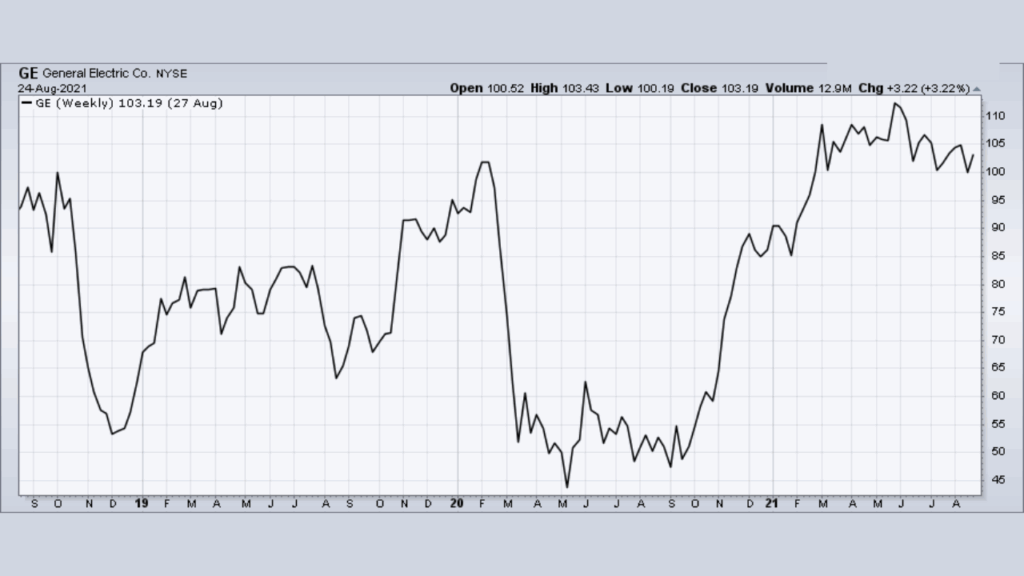
Bar charts are widely used by traders and investors. A bar chart’s price plot is made up of the high, low, and closing for each period. The vertical bar’s top and bottom reflect the high and low, while the short horizontal line that crosses the vertical bar indicates the close (see chart below). The high, low, and close for a given day are shown by each bar on a daily chart. Based on Friday’s close as well as the high and low, weekly charts would display a bar for each week.
Bar chart with high, low, and close.
The open, high, low, and close can also be shown in bar charts (see chart below).The addition of the open price, which appears as a little horizontal line to the left of the bar, makes the difference. The data at hand determines whether or not the open is displayed in a bar chart.
Bar chart displaying open, high, low, and close.
Bar charts are an effective way to display a lot of data. Line charts offer less information (no high-low range) despite being simpler. Because each bar chart is fairly small, users can fit more bars while still keeping the display looking neat.
If you are not interested in the opening price, bar charts are ideal for analyzing the close in relation to the high and low. It’s common for open-ended bar charts to become congested. You’re probably better off using candlestick charts if you’re curious about the opening price. But bear in mind that 200 data points could take up a lot of room on a candlestick chart, making it appear cluttered.
Candlestick Chart
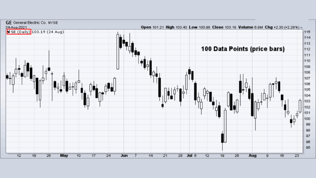
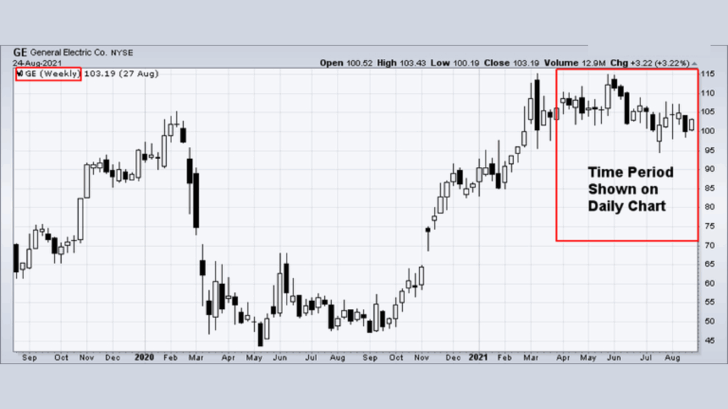
Originating in Japan over 300 years ago, candlestick charts have become quite popular recently. The open, high, low, and close are required for a candlestick chart. A daily candlestick is based on the open price, the intraday high and low, and the close. A weekly candlestick is based on Monday’s open, the weekly high-low range, and Friday’s close.
Many traders and investors believe that candlestick charts are easy to read, especially the relationship between the open and the close. Hollow candlesticks form when the close is higher than the open, and filled candlesticks form when the close is lower. The rectangular area between the open and close is called the body (hollow body or filled body). The lines above and below are called shadows and represent the high and low.

Example of hollow and filled candlestick bars.
Some candlestick charts use color to show the relationship between the close and the previous close. If the close is higher than the previous, you can choose to display the bar as green; if it is lower, you can choose to display the bar as red (see chart below).

Example of a candlestick chart with green and red bars.
See this ChartSchool article for more information about candlestick charts.
Learn More. Start your candlestick journey here.
Point & Figure Chart
All the charting methods mentioned above plot one data point for each period. Regardless of price movement, each day or week is represented by one point, bar, or candlestick along the time scale. Even if the price is unchanged from one day to the next or one week to the next, a dot, bar, or candlestick is plotted to mark the price action. Contrary to this methodology, point & figure charts are based solely on price movement and don’t take time into consideration. There is an x-axis, but it doesn’t extend evenly across the chart.
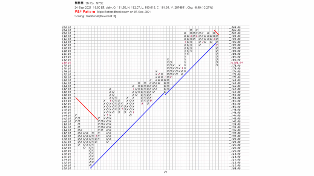
An example of a Point & Figure chart.
The beauty of point & figure charts is their simplicity. Little or no price movement is deemed irrelevant and, therefore, not duplicated on the chart. Only price movements that exceed specified levels are recorded. This focus on price movement makes identifying support and resistance levels, bullish breakouts, and bearish breakdowns easier.
Learn More. Know the basics, chart patterns, price objectives, and more about P&F charts.
Price Scaling
There are two methods for displaying the price scale along the y-axis: arithmetic and logarithmic. An arithmetic scale displays 10 points (or dollars) as the same vertical distance regardless of the price level. Each unit of measure is identical throughout the entire scale. If a stock advances from 10 to 80 over six months, the move from 10 to 20 will appear to be the same distance as the move from 70 to 80. Even though this move is the same in absolute terms, it is not the same in percentage terms.
A logarithmic or log scale measures price movements in percentage terms. An advance from 10 to 20 would represent an increase of 100%. An advance from 20 to 40 would also be 100%, as would an advance from 40 to 80. All three advances would appear as the same vertical distance on a log scale. Most charting programs refer to the log scale as a semi-log scale because the time axis is still displayed arithmetically.
The charts below illustrate the difference between arithmetic and logarithmic scaling.
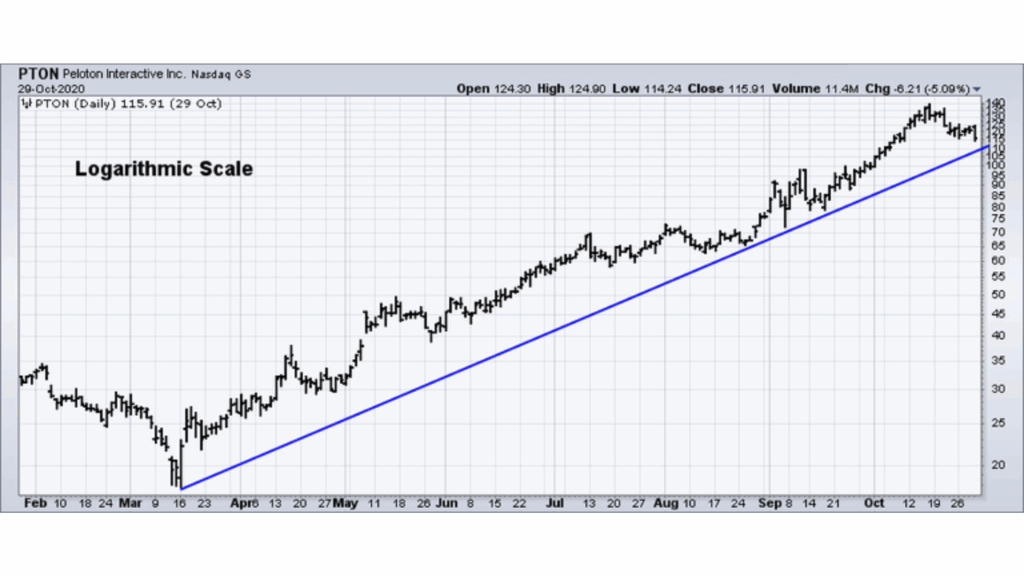
Example of a logarithmic scale price chart.
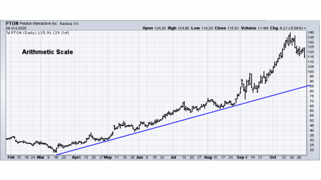
Example of an arithmetic scale price chart.
On the log scale version, the distance between 20 and 40 is the same as the distance between 40 and 80. However, on the arithmetic scale, the distance between 40 and 80 is significantly greater than the distance between 20 and 40.
Key points on the benefits of arithmetic scale charts include:
- Arithmetic scales are useful when the price range is confined within a relatively tight range.
- Arithmetic scales are useful for short-term charts and trading. Price movements (particularly for stocks) are shown in absolute dollar terms and reflect movements dollar for dollar.
Key points on the benefits of log scale charts include:
- Log scales are useful when the price has moved significantly, be it over a short or extended timeframe
- Trend lines tend to match lows better on log scale charts.
- Log scale charts are useful when gauging the percentage movements over a long period. Large movements are put into better perspective.
Stocks and many other securities are judged in relative terms through the use of ratios such as PE, Price/Revenues and Price/Book. With this in mind, it also makes sense to analyze price movements in percentage terms.
you may be interested in this blog here:-
What’s the difference between Treasury bonds, notes, and bills
Can I Open a Brokerage Account for My Child
What is the Contrast Between Favored Stock and Normal Stock?