

How to Pick a Timeframe
The timeframe for creating a chart depends on the compression of the data—intraday, daily, weekly, monthly, quarterly, or annual. The less compressed the data, the more detail is displayed.
Below, you see an example of a daily and weekly chart.
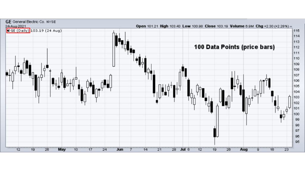
Daily chart
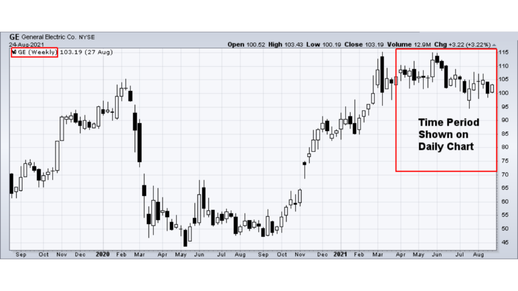
Weekly chart
Daily data consists of intraday data compressed to show each day as a single data point or period. Weekly data includes daily data that has been compressed to show each week as a single data point. A 100 data points (or periods) on the daily chart is equal to the last five months of the weekly chart (data marked in the red rectangle).
The more the data is compressed, the longer the timeframe possible for displaying the data. If the chart can display 100 data points, a weekly chart will hold 100 weeks (almost two years). A daily chart that displays 100 days would represent about five months. There are about 20 trading days in a month and about 252 trading days in a year. There’s no right data compression and timeframe to use. It depends on the data available and your trading or investing style.
- Traders usually concentrate on charts made up of daily and intraday data to forecast short-term price movements. The shorter the timeframe and the less compressed the data is, the more detail that is available. While long on detail, short-term charts can be volatile and contain a lot of noise. Large sudden price movements, wide high-low ranges, and price gaps can affect volatility, which can distort the overall picture.
- Investors usually focus on weekly and monthly charts to spot long-term trends and forecast long-term price movements. Because long-term charts (typically one to four years) cover a longer timeframe with compressed data, price movements do not appear as extreme and there is often less noise.
- Some investors might use a combination of long- and short-term charts. Long-term charts are good for analyzing the big picture to get a broad perspective of historical price action. After analyzing the general picture, you can use a short-term chart such as a daily chart to zoom in on a narrower range of time (e.g., the last few months).
you may be interested in this blog here: