

Random Walk vs. Non-Random Walk
Introduction
The famous argument between random and non-random walkers is still going strong. These theories are best illustrated by two competing books. Burton Malkiel’s 1973 book A Random Walk Down Wall Street is now considered a classic in the field of investment literature. Princeton economist Malkiel contends that investors cannot beat the main indices because price fluctuations are mostly random.
Random Walk vs Non-Random Walk
The counterargument is presented in the 2001 book A Non-Random Walk Down Wall Street, which was aptly titled by Andrew W. Lo and A. Craig MacKinlay. MacKinlay, a professor of finance at Wharton, and Lo, a professor of finance at MIT, contend that there are predictable components and that price swings are not entirely random. Now let’s get the fight started!
wanty to learn about technical Analysis in brief
Random Walk Theory
With “random walk”, Malkiel asserts that price movements in securities are unpredictable. Because of this random walk, investors cannot consistently outperform the market as a whole. Applying fundamental analysis or technical analysis to time the market is a waste of time that will simply lead to underperformance. Investors would be better off buying and holding an index fund.
Malkiel offers two popular investment theories that correspond to fundamental analysis and technical analysis. On the fundamental side, the “Firm-Foundation Theory” argues that stocks have an intrinsic value that can be ascertained by discounting future cash flows (earnings). Investors can also use valuation techniques to ascertain the true value of a security or market. Investors decide when to buy or sell based on these valuations.
On the technical side, the “Castle-in-the-Air Theory” assumes that successful investing depends on behavioral finance. Investors must determine the mood of the market – bull or bear. Valuations are not important because a security is only worth what someone is willing to pay for it.
Random walk theory jibes with the semi-strong efficient hypothesis in its assertion that it is impossible to outperform the market on a consistent basis. This theory argues that stock prices are efficient because they reflect all known information (earnings, expectations, dividends). Prices quickly adjust to new information and it is virtually impossible to act on this information. Furthermore, price moves only with the advent of new information and this information is random and unpredictable.
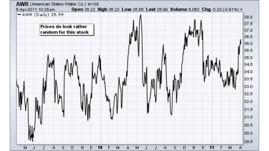
Random Prices Example on American States Water Co. Chart
In short, Malkiel attributes any outperformance success to lady luck. If enough people try, some are bound to outperform the market, but most are still likely to underperform.
Non-Random Walk Theory
A Non-Random Walk Down Wall Street is a collection of essays offering empirical evidence that valuable information can be extracted from security prices. Lo and MacKinlay used powerful computers and advanced econometric analysis to test the randomness of security prices. Although this book is a heavy read, the findings should be of interest to technical analysts and chartists. In short, this book documents the presence of predictable components in stock prices.
Just prior to this book, Andrew Lo wrote a paper for the Journal of Finance in 2000: Foundations of Technical Analysis: Computational Algorithms, Statistical Inference, and Empirical Implementation. Harry Mamaysky and Jiang Wang also contributed. The paper’s opening remarks say it all:
Example of Head and Shoulders Pattern on Apple Chart
Dow Theory
There is also proof that one of the oldest systems around can outperform the market and reduce risk. Dow Theory seeks to buy when both the Dow Transports and the Dow Industrials record new reaction highs and sell or move into treasuries when both record new reaction lows. The move out of stocks and into treasuries greatly reduces risk because one is not exposed to riskier stocks. There have been a few big bad bear markets over the years and preserving capital is one of the keys to investment success.
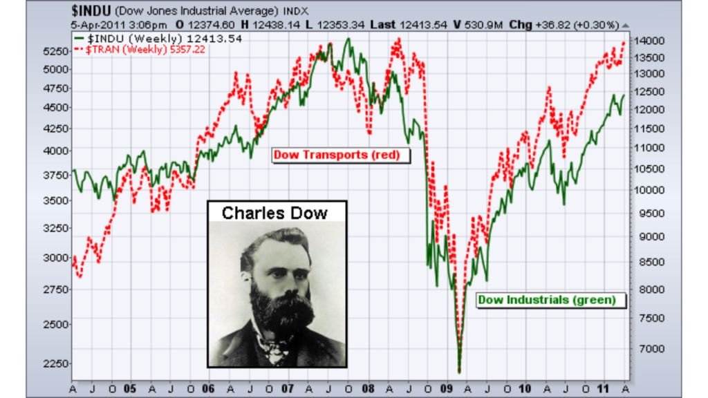
Dow Theory Example on Dow Jones Industrial Average Chart
Stephen Brown of New York University, William Goetzmann of Yale, and Alok Kumar of the University of Notre Dame published a study on Dow Theory in the Journal of Finance. The Dow theory system was tested against buy-and-hold for the period from 1929 to 1998. Over the 70-year period, the Dow theory system outperformed a buy-and-hold strategy by about 2% per year. In addition, the portfolio carried significantly less risk. If compared using risk-adjusted returns, the margin of outperformance would be even greater. Over the 18 years from 1980 to 1998, the Dow theory system has underperformed the market by about 2.6% per year. However, when adjusted for risk, the Dow theory system significantly outperformed buy-and-hold over this timeframe. Keep in mind that 18 years is not a long time in the history of the market and this period was during one of the greatest bull markets in history (1982 to 2000).
Fat Tails and Trends
Historic stock returns are not normally distributed. What does this mean? If one were to measure the height of 1000 people and plot the distribution, this distribution would form the classic bell curve. The most recurring height (value) would be in the middle and the remaining heights would be equally distributed on either side. Furthermore, 68.5% of all values would fall within ±1 standard deviation of the mean, 95.4% would fall within ±2 standard deviations and 99.7% would fall within ±3 standard deviations. The solid black line shows a typical bell curve with a normal distribution.

Illustration of Normal Distribution Bell Curve and Fat Tails
Statisticians have found that a distribution of stock returns forms a curve with “fat tails”. In a normal distribution, 99.7% of all these returns would be within ±3 standard deviations of the mean. This, however, is not the case for stock returns. Instead, the distribution has fat tails, shown in the dotted lines on the graphic above. This means a relatively high number of returns fall outside the normal distribution. Some are lower and some are higher. These abnormal returns provide evidence of extended moves, outsized moves or trends. Note that the image above is just a hypothetical example to illustrate a point.
Visual Evidence
Anybody who has spent any time following the stock market knows that trends can and will emerge. Since trends don’t persist forever, it’s fair to say that not all stocks trend. Nonetheless, there are enough sectors, industry groups, equities, significant indexes, and asset classes to guarantee that something is moving eventually. As usual, the difficulty lies in identifying and following that trend. A few particular stocks with distinct indications and trends are displayed in the next three charts. A great deal of suffering may have been saved by spotting a straightforward double top and leaving Citigroup (C). The same is true of Worldcom, Enron, and a few other financial disasters.
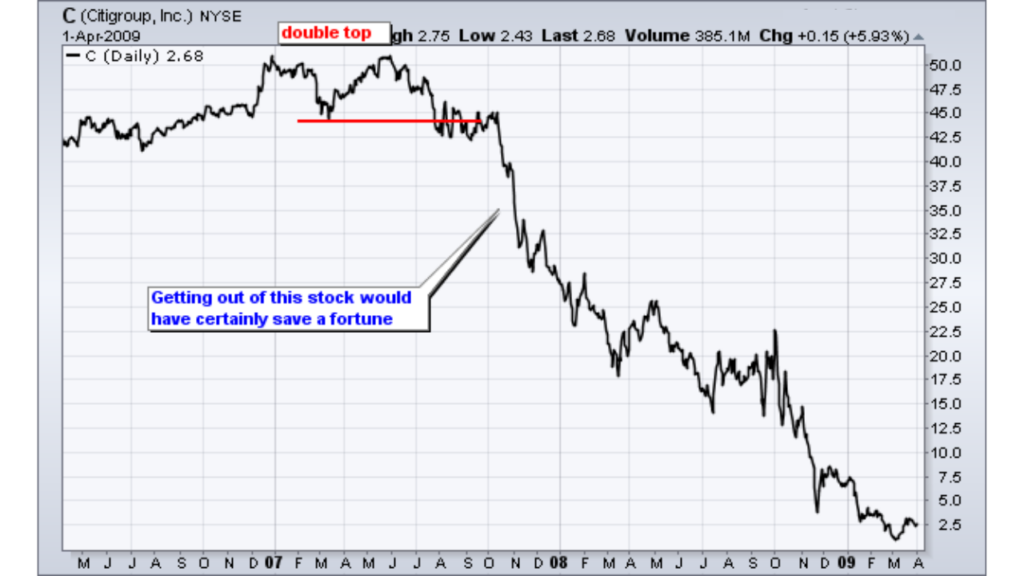
Example of a Double Top Pattern on a Citigroup Chart
ExxonMobil (XOM) was choppy in 2009, down the first half of 2010 and then up sharply from July 2010 to February 2011. Catching this one big trend would have made up for quite a few losses.
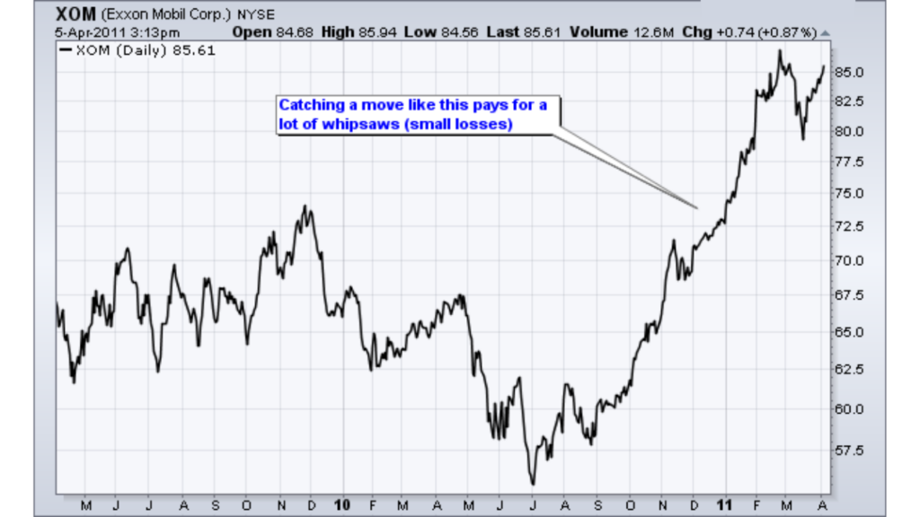
Example of a Trend on a Exxon Mobile Chart
Pfizer (PFE) shows an example of three sizable trends emerging over a two year period. The stock was up over 50% in 2009, down about 25% in the first half of 2010 and up around 50% from July 2010 to March 2011.
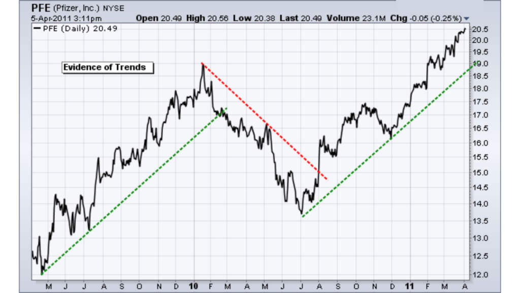
Example of Trends on a Pfizer Chart