Technical Analysis: General Steps
Many technicians apply a top-down approach that begins with broad-based market analysis, then narrows down to specific sectors/industries, and ultimately analyzes individual stocks.
Technical analysis’s adaptability is what makes it so beautiful. Each of these levels of analysis can be carried out utilizing the same theoretical foundation because technical analysis principles are universally applicable. Analysis of a market index chart does not require a degree in economics. You can evaluate a stock chart without being a certified public accountant. Charts are, well, charts. Whether the timescale is two days or two years is irrelevant. It makes no difference if you’re examining a commodity, market index, or stock. Any chart can benefit from the use of technical concepts such as trend, trading range, support, resistance, and others. Even though this seems straightforward, technical analysis is really complex. Serious study, commitment, and an open mind are necessary for success.
Chart Analysis Basics
Technical analysis can be either simple or complicated .How you use it will determine this.Some fundamental concepts of chart analysis are demonstrated in the example below. The emphasis will be on identifying bullish scenarios in this chart because you are most likely interested in purchasing stocks.
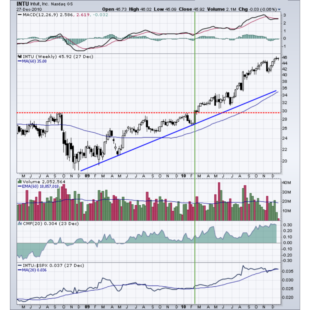
Overall Trend. The first step is to identify the overall trend. You can do this with trend lines, moving averages, or peak/trough analysis. For example, as long as price remains above its upward-sloping trend line or specific moving averages, the trend is up. Similarly, the trend is up as long as higher lows form on pullbacks and higher highs form on advances.
Support. Congestion areas and previous lows below the current price mark the support levels. A break below support would be considered bearish and detrimental to the overall trend.
Resistance. Congestion areas and previous highs above the current price mark resistance levels. A break above resistance would be considered bullish and positive for the overall trend.
Momentum. Momentum is usually measured with an oscillator such as MACD. If MACD is above its 9-day EMA (exponential moving average) or positive, momentum will be considered bullish or at least improving.
Buying/Selling Pressure. For stocks and indices with volume figures available, an indicator that uses volume is used to measure buying or selling pressure. When the Chaikin Money Flow is above zero, buying pressure is dominant. Selling pressure is dominant when it is below zero.
Relative Strength. The price relative is plotted as a line that divides the security by a benchmark. For stocks, the price is usually divided by the S&P 500. The relative strength plot indicates if the stock is outperforming (rising) or underperforming (falling) the major index.
The final step is to synthesize the above analysis to ascertain the following:
- Strength of the current trend.
- Maturity or stage of the current trend.
- Reward-to-risk ratio of a new position.
- Potential entry levels for a new long position.
The example above analyzed the chart for an individual stock, but these techniques can be applied to sectors or broad market indexes.
Top-Down Technical Analysis
Many technicians employ a top-down approach to technical analysis, starting with broad-based macro analysis and ending with a more focused/micro perspective:
- Broad market analysis using major indices such as the S&P 500, Dow Industrials, NASDAQ and NYSE Composite.
- Sector analysis to identify the strongest and weakest groups within the broader market.
- Individual stock analysis to identify the strongest and weakest stocks within select groups.
For each segment (market, sector, and stock), an investor would analyze long-term and short-term charts to find those that meet specific criteria. Analysis will first consider the market in general, perhaps the S&P 500. If the broader market were considered to be in bullish mode, analysis would proceed to a selection of sector charts.
Those sectors that show the most promise would be singled out for individual stock analysis. Once the sector list is narrowed to 3-4 industry groups, individual stock selection can begin.
With a selection of 10-20 stock charts from each industry, a selection of 3-4 of the most promising stocks in each group can be made. How many stocks or industry groups make the final cut will depend on the strictness of the criteria set forth. Under this scenario, we would be left with 9-12 stocks from which to choose. These stocks could even be broken down further to find the 3-4 that are the strongest of the strong.
you may be interested in this blog here: