
Sector Rotation Analysis
Based on the relative performance of the eleven S&P Sector SPDR ETFs, Sector Rotation Analysis aims to connect the stock market’s current strengths and weaknesses with the overall business cycle. Once the strong and weak sectors have been determined, you may compare the results to a theoretical business cycle chart to potentially identify the market’s business cycle stage. You may then use that information to forecast which industries will have the most growth in the upcoming weeks and months.
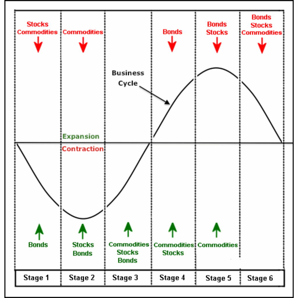
The Business Cycle
Sector Rotation Analysis
- Stage 1 shows the economy contracting and bonds turning up as interest rates decline. Economic weakness favors loose monetary policy and the lowering of interest rates, which is bullish for bonds.
- Stage 2 marks a bottom in the economy and the stock market. Even though economic conditions have stopped deteriorating, the economy is still not at an expansion stage or actually growing. However, stocks anticipate an expansion phase by bottoming before the contraction period ends.
- Stage 3 shows a vast improvement in economic conditions as the business cycle prepares to move into an expansion phase. Stocks are rising and commodities are anticipating an expansion phase by turning up.
- Stage 4 marks a period of full expansion. Both stocks and commodities are rising, but bonds turn lower because the expansion increases inflationary pressures. To combat this, interest rates start to move higher.
- Stage 5 marks a peak in economic growth and the stock market. Even though the expansion continues, the economy grows at a slower pace because rising interest rates and rising commodity prices take their toll. Stocks anticipate a contraction phase by peaking before the expansion actually ends. Commodities remain strong and peak after stocks.
- Stage 6 marks a deterioration in the economy as the business cycle prepares to move from an expansion phase to a contraction phase. Stocks have already been moving lower and commodities now turn lower in anticipation of decreased demand from the deteriorating economy.
Keep in mind that this is the ideal business cycle in an inflationary environment. Stocks and bonds advance together in stages 2 and 3. Similarly, both decline in stages 5 and 6. This would not be the case in a deflationary environment, when bonds and stocks would move in opposite directions.
Sector Rotation
It should come as no surprise that the business cycle affects how industrial groups and stock market sectors rotate. At particular stages of the business cycle, some industries do better than others. Investors can position themselves in the correct sectors and steer clear of the wrong ones by understanding the stage of the business cycle.
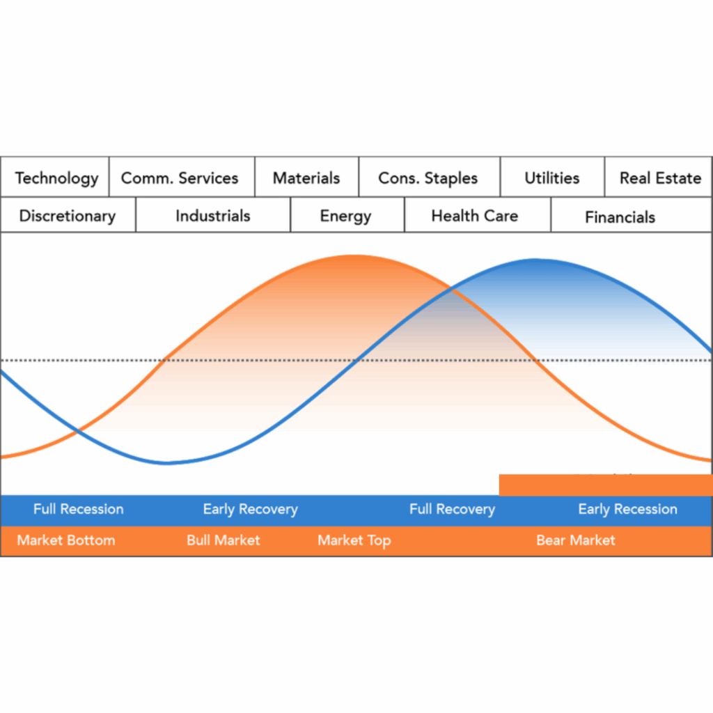
Sector Rotation Model
The top-performing industries are displayed at the top of the graph, which also displays the stock market cycle in orange and the economic cycle in blue. The business cycle depicted above is equivalent to the blue economic cycle.The midline denotes the economy’s threshold for contraction or expansion. Observe how the business cycle is led by the orange market cycle. Prior to the economic cycle turning, the market rises and crosses the centerline. Ahead of the economic cycle, the market also declines and passes below the centerline.
The technology sector is the first to turn up in anticipation of a bottom in the economy. Consumer discretionary stocks are not far behind. These two groups are the big leaders at the beginning of a bull run in the stock market.
The relative strength of materials and energy indicates the peak of the market cycle.Rising commodity prices and more demand from a growing economy are advantageous to these industries. The market reaches a tipping point when consumer staples overtake energy as the dominant category. This indicates that the economy is beginning to suffer from rising commodity prices.
Following the market high and decline, the economy declines. At this point, the yield curve steepens and the Fed begins to cut interest rates. Interest rate declines help banks and debt-ridden utilities. Additionally, the steepening yield curve promotes lending and increases bank profitability. The cycle inevitably repeats itself once the market bottoms out due to low interest rates and easy money.
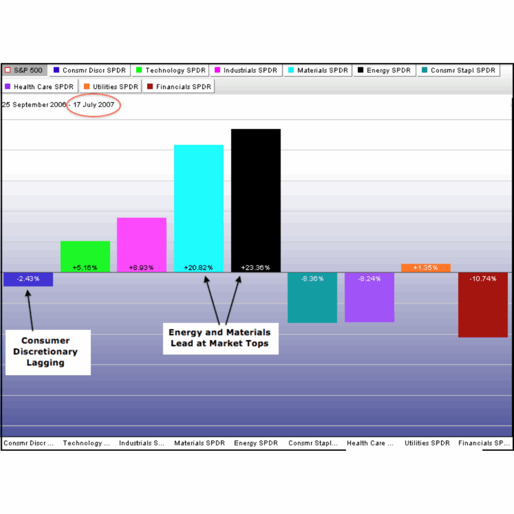
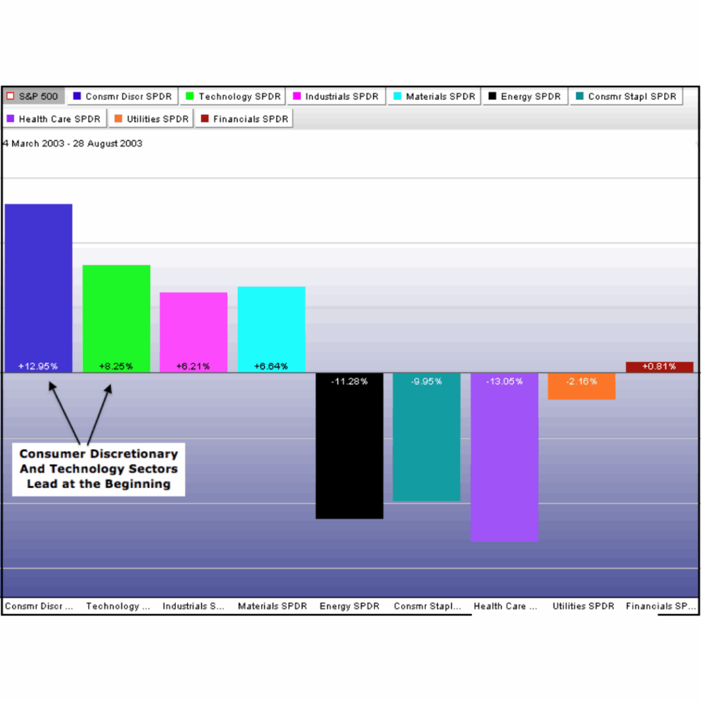
Relative performance for the (then nine) sector SPDRs is displayed in the two sector PerfCharts below, following the 2003 bottom and close to the 2007 top. The S&P 500 broke down in the fourth quarter of 2007 after peaking from July to October. The market was dominated and exhibiting relative strength in the summer of 2007 by the Energy and Materials sectors. Consumer Discretionary was trailing the S&P 500, as you can see. At a market high, this sector movement is consistent with expectations.
Sector Rotation Analysis
Following its March 2003 bottom, the S&P 500 went on a strong bull run that culminated in the summer of 2007. The first recovery from the March 2003 low was spearheaded by the technology and consumer discretionary sectors. The relative strength of these two confirmed the significance of the 2003 bottom.
Sector Rotation Analysis
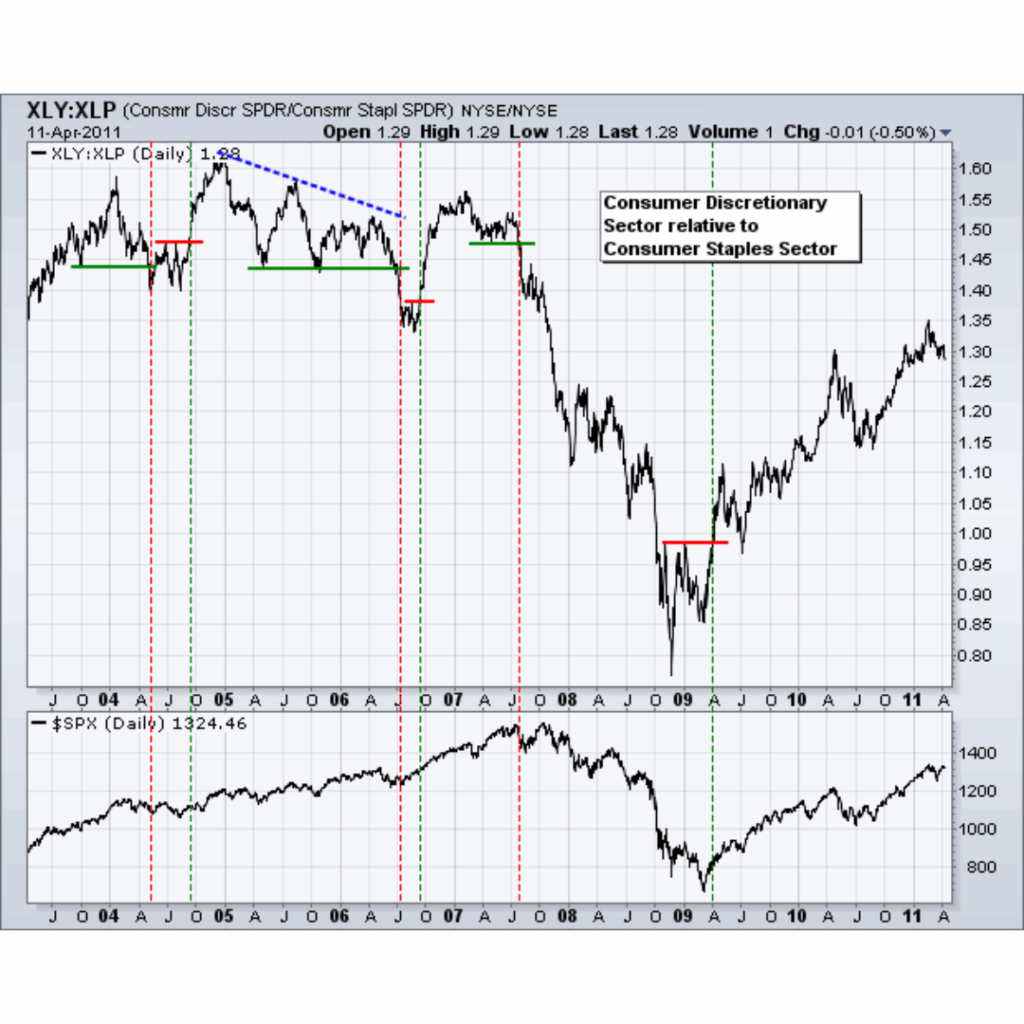
Staples/Discretionary Ratio
For hints about the state of the economy, chartists might also examine the performance of the consumer staples and discretionary sectors. In the consumer discretionary sector, stocks stand in for optional goods.These industry groups include restaurants, vehicles, shoe manufacturers and merchants, and clothing stores. The consumer staples sector’s stocks include necessities like toothpaste, detergent, groceries, drinks, and medications. When the economy is strong and expanding, the consumer discretionary sector often does well. When the economy is weak or contracting, this industry does poorly.
Stapes/Discretionary Ratio
A straightforward ratio chart that divides the Consumer Staples SPDR (XLP) by the Consumer Discretionary SPDR (XLY) allows chartists to analyze the performance of these two. This ratio with the S&P 500 is displayed in the above chart. In 2004, 2005, and 2006, the ratio was a little up and down.When the consumer discretionary sector underperformed the consumer staples sector in 2007, a severe decline began. In other words, the consumer discretionary sector did not fare as well as the consumer staples sector. Additionally, take note of the fact that this ratio broke support before the market and peaked before the S&P 500 in 2007. When the S&P 500 recovered from its March 2009 low, the ratio broke through resistance after bottoming out ahead of the S&P 500 in late 2008.